A single source of truth for how the Dr. Lisa Marie Bobby brand shows up everywhere it appears — the website, both YouTube shows and their cover art, the blog, and social. One system across every channel.
Both podcasts are expressions of the same parent brand: Dr. Lisa Marie Bobby / LHS Media. They share a wordmark, a typographic voice (Playfair Display), a warm editorial sensibility, and a common cover-art architecture. Each show then gets its own color signature and audience-specific voice.
YouTube: @DrLisaMarieBobby · 5.76K subscribers · 500+ videos
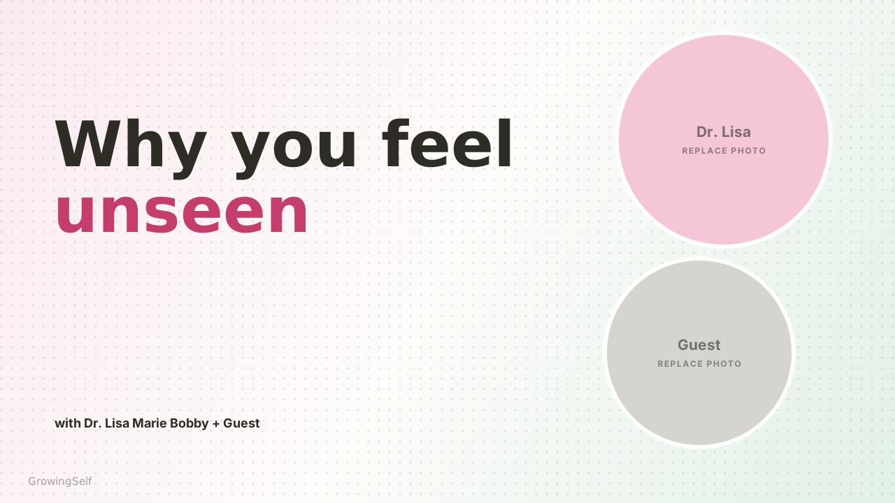
The flagship consumer show. Warm, hopeful psychology for a general audience — relationships, anxiety, self-growth. Cover art leans blush-pink and airy, with charcoal headlines and a single expressive accent word.
YouTube: @LHSForTherapists
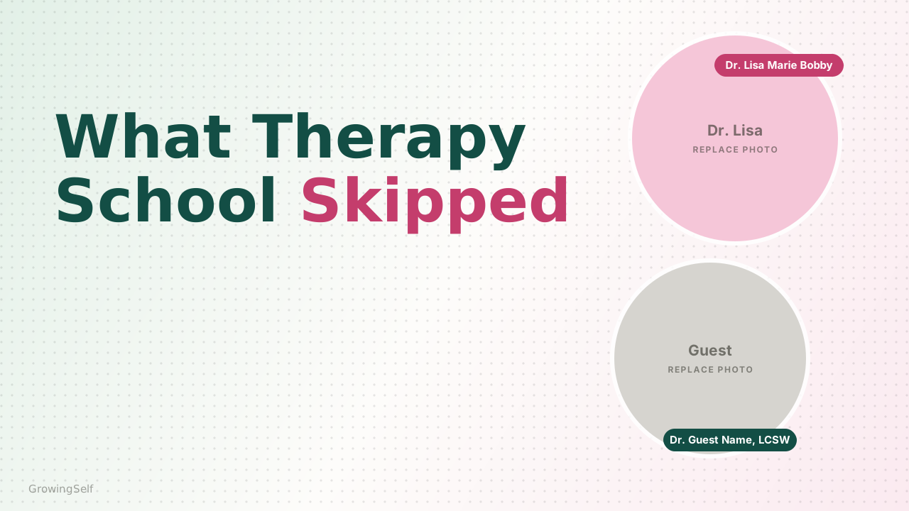
The professional spin-off for clinicians and private-practice owners. Same editorial DNA, but a deeper, more clinical palette (deep pine), name-pill labelling of guests, and a business/craft-of-therapy voice.
The name always sets in Playfair Display, regular weight, normal (non-italic) case as written — never all-caps, never letter-spaced. On the website it renders in coral in light mode and gold in dark mode.
Two connected palettes. The web palette governs the website and UI. The cover-art palette is the softer, more editorial range that appears across current YouTube thumbnails for both shows.
Cover headlines use a charcoal or pine base plus one expressive accent color per episode, drawn from this range. Berry-rose is the signature; it also fills the Dr. Lisa name-pill on LHSFT art.
Each show carries a rounded pill in its accent color. LHS is berry-rose; LHSFT is teal blue (chosen so it reads as a clear color rather than the grayish pine at a light tint).
Tip: click any swatch to copy its hex.
Web and cover art now share one warm color — coral #E8735A. The old cover-only "terracotta" has been retired so the site and the thumbnails read as one system. Berry-rose #C43D6C remains the signature pink accent; the two live together as a warm/cool pair.
The same system, combined. Every cover is one base color + one accent + one pastel ground. LHS sets the headline in warm charcoal; LHSFT sets it in deep pine and adds name pills. These are schematic (photos shown as color circles) — use them to see which pairings work.
Rule of thumb across every card: never two accents on one cover. The base carries the show (charcoal = LHS, pine = LHSFT); the single italic word carries the color.
A two-typeface system carries everything: an elegant serif for display and headlines, a clean sans for captions, labels and UI. This pairing is consistent across the website and both podcasts.
Every headline, show title, wordmark and cover-art hook. Mix upright and italic in the same line — italic carries the emotional emphasis word. Weights 400–800.
Body copy, episode captions ("with Dr. Lisa Marie Bobby + Guest"), name pills, buttons and metadata. Kept bold and tight on cover art for legibility at thumbnail size.
The brand's most recognizable typographic device is a Playfair headline where most words sit upright and one key word switches to colored italic. It creates rhythm and points the eye at the emotional payload of the title.
Web-font note: This guide previews Playfair Display & Inter from Google Fonts. Confirm the website's exact body sans before finalizing — the roles above hold regardless of the specific sans chosen.
The flagship show for a broad, wellness-minded audience. The visual mood is light, warm and hopeful — blush and mint pastels, generous white space, and an emotional one-line hook.
Bright blush-pink field with a repeating diagonal "LOVE HAPPINESS SUCCESS" watermark. Dr. Lisa is centered, seated. Overlaid title reads "LOVE, HAPPINESS & SUCCESS" in bold white uppercase sans, with "with Dr. Lisa Marie Bobby" beneath.
Circular headshot of Dr. Lisa on a blush-pink ground. Handle @DrLisaMarieBobby; channel name "Love, Happiness, and Success — with Dr. Lisa." Link out to growingself.com.
A recreated schematic of the current LHS thumbnail system:
Schematic recreation for spec purposes. An editable layered PSD template (LHS_cover_template.psd) ships alongside this guide — opens in Canva, Photoshop, Affinity Designer & Pixelmator Pro, with the dot texture on its own adjustable layer. A live-text SVG version is also provided for editing headlines directly.
In the template files the background dot-grid is turned up on purpose — it's set more visible so the layer is easy to find and select. For finished cover art, reduce that layer's opacity (roughly 30–50%) so the dots read as a subtle, premium accent rather than a foreground pattern, keeping the airy feel of the current episodes. It lives on its own layer (“Background dots — adjust opacity”) in both the PSD and SVG.
Background: airy pastel gradient — blush-pink or mint — fading to near-white in the center, with a soft dot-grid texture (its own adjustable layer in the template).
Headline: Playfair Display, warm-charcoal base, one italic accent word in berry-rose, leaf green, teal-blue or coral.
Caption: "with Dr. Lisa Marie Bobby + [Guest]" in bold charcoal Inter, below the headline.
Photos: circular headshots — Dr. Lisa almost always in a blush-pink circle, guest in a plain/white circle, usually stacked. Layout side (left/right) flips for variety.
Marks: small italic "GrowingSelf" watermark; YouTube duration badge bottom-right.
Warm, empathetic, hopeful and a little conversational. Speaks directly to "you." The cover hook is emotional and human; the YouTube title is practical and searchable.
Formula: emotional hook on the art → "How to [outcome]: [angle] | [Guest]" as the title. Sentence-friendly, never clinical jargon.
The professional show for clinicians, coaches and private-practice owners. Same editorial architecture as LHS, dialed to feel more grounded and expert — deeper pine-teal typography and clearly labelled guest credentials.
A recreated schematic of the current LHSFT thumbnail system:
Schematic recreation for spec purposes. An editable layered PSD template (LHSFT_cover_template.psd) plus a live-text SVG ship alongside this guide — same app support, with pine-teal headline, name pills and dot texture on separate layers. As with LHS, dial the dot-texture layer opacity down (~30–50%) for the final art.
Background: same pastel gradients, but mint-green appears more often and the color is a touch more saturated.
Headline: base color shifts from charcoal to deep pine #134E45, still with a berry-rose italic accent word.
Name pills: the signature LHSFT device — each headshot carries a rounded name pill. Dr. Lisa's pill is berry-rose; guests get pine-teal or berry pills stating their name and credential (LCSW, PhD, etc.).
Photos: two stacked circles, Dr. Lisa top in a blush-pink circle, guest below.
Marks: same "GrowingSelf" watermark and duration badge.
Peer-to-peer and credible — Dr. Lisa talking shop with fellow professionals. Still warm, but more candid about the business and craft of therapy. Titles name the professional topic and credential the guest.
Formula: candid pro hook on the art → "[Clinical/business topic] for Therapists | [Guest, credential]." Always credential the expert.
Everything the two shows share, and the handful of deliberate differences that keep them distinct siblings.
| Element | LHS — Love, Happiness & Success | LHSFT — LHS For Therapists |
|---|---|---|
| Audience | General / wellness consumer | Therapists, coaches, practice owners |
| Handle | @DrLisaMarieBobby | @LHSForTherapists |
| Headline typeface | Playfair Display | Playfair Display (same) |
| Headline base color | Warm charcoal #2D2D25 | Deep pine #134E45 |
| Italic accent word | Berry / leaf green / teal-blue / coral | Berry-rose (same device) |
| Background | Blush-pink leaning, very airy | Mint-green appears more, slightly richer |
| Guest labelling | "with Dr. Lisa Marie Bobby + Guest" caption | Name pills on each photo (+ credential) |
| Photo treatment | Circular; Lisa in blush circle + guest | Circular; Lisa in blush circle + guest (same) |
| Watermark | "GrowingSelf" | "GrowingSelf" (same) |
| Voice | Warm, hopeful, direct-to-"you" | Candid peer-to-peer, credentialed |
| Title pattern | How to [outcome]: [angle] | Guest | [Pro topic] for Therapists | Guest, credential |
1280×720 canvas · Playfair headline, one italic accent word · correct base color for the show (charcoal = LHS, deep pine = LHSFT) · Dr. Lisa in blush circle · guest labelled (caption for LHS, pill for LHSFT) · single accent color · GrowingSelf watermark · text off the photos · legible at 210 px.
Pulled from Dr. Lisa's long-form writing (the Growing Self blog) and her social bios, so titles, captions, show notes and posts all sound like one person. The rule of thumb: credentialed but human.
Blog posts and show notes follow a dependable arc — reuse it:
Every long-form piece embeds the episode (YouTube + audio player + platform buttons), links chapter timestamps, and includes the full transcript for SEO.
Use the full credential string on professional and by-line contexts; the site title stays clean.
Common category tags: Healthy Relationships · Communication · Marriage · Emotional Intelligence · Anxiety · Self-Growth.
Ready-to-edit cover-art templates for both shows, built to the specs in this guide. Drop in a headshot, retype the headline, and export at 1280×720.
Both shows (LHS + LHSFT) as layered Photoshop files. Opens in Canva, Photoshop, Affinity Designer & Pixelmator Pro, with every element on its own named layer — background, dot texture, photo circles, headline, name pills, watermark. Text layers are rasterized (retype to edit wording).
↓ Download PSD templates (.zip)Live, editable-text versions — best for editing headlines directly in Affinity Designer or Pixelmator Pro. Install the free Playfair Display & Inter fonts for an exact match.
↓ LHS template (.svg) ↓ LHSFT template (.svg)Reminder: the background dot texture is turned up in these files so the layer is easy to find — reduce its opacity (~30–50%) for finished art.
Social media
The podcast cover-art system extends cleanly to social. The same Playfair two-tone headline, italic accent word, circular headshots and pastel palette carry across every platform — only the crop, format and voice-weighting change.
Instagram — @drlisamariebobbyProfile
Identity
Handle: @drlisamariebobby (verified)
Name field: “Dr. Lisa Marie Bobby | Psychologist”
Avatar: the blush-circle headshot, identical to YouTube & the site.
Bio: mission line → 🌱 Founder of Growing Self → 💗 Host of the LH&S podcast → link.
Story Highlights
A branded set: ink-black circle covers with the category word in caps, each in a brand accent — Happiness teal, Success gold, Love berry, Livestreams coral. Keep new highlights on the same template, drawing the label color from the palette.
Reversed set — same idea, flipped: the brand color fills the circle and the label is white. Handy for a bolder, more colorful row. One exception: white fails contrast on the lighter gold, so Success uses ink-black text on its gold fill.
Feed formats
Four recurring post types keep the grid varied but unmistakably on-brand. Recreated schematics:
Topic-bar color = subject: green for growth / confidence / mindset, berry for love / relationship / connection. A 4th recurring type is the carousel framework (“Which one are you? The Fixer / Avoider / Connector / Explorer… check it out ›”) on a pastel illustrated background — ideal for turning an episode's model into a swipeable.
Instagram specs & rules
drlisamariebobbywatermark, and the brand palette — even over photography.Positioning
LinkedIn is the brand's professional face, so it leans on the website's own palette — coral and gold on warm charcoal or ink black — rather than the pastel podcast-cover colors. The voice stays peer-to-peer and credentialed; the look is more restrained and authoritative. Lead with a dark, editorial share image: gold eyebrow, cream or charcoal Playfair headline, one coral italic accent, and always credential the expert.
LinkedIn specs & rules
LinkedIn guidance is brand-derived
These LinkedIn recommendations come from the brand system plus current platform best practices, not from a specific audited profile. Share the LinkedIn page/handle you want to standardize on and I'll tailor this section — banner, avatar, and post templates — to match exactly.